John J. Graham:
Behind the Peacock’s Plumage
Jennifer Jue-Steuck
Artist, designer, esteemed colleague of Lou Dorfsman and Herbert
Lubalin, alumnus of New York School of Industrial Art, and NBC’s
Art Director from 1956 to 1977, John Graham led a team of fifteen
and engendered all NBC on-air promotion, promotional kits, exhib-
its, displays, newscast film openings, and print advertisements
including magazines and newspapers. During his long and prolific
career, he earned more than seventy-five design awards, yet few
Americans today know of his contribution to the history of American
graphic art and television.
Among his prestigious honors, the greatest success of his
career has proven to be the longevity of his NBC peacock. With
the advent of color television in the 1950s came the need to inform
viewers that they were watching a program broadcast in color,
regardless of whether or not they had color sets. Lawrence K.
Grossman, a former NBC vice president, NBC News president, and
PBS president recalls the questions facing the network: “What should
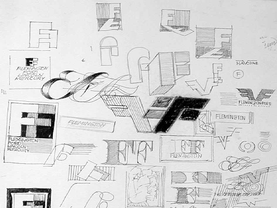
Figure 1
FF and Peacock Designs. All figures reprinted
with the permission of Bruce A. Graham,
© Copyright Estate of John J. Graham.
© Copyright 2003 Massachusetts Institute of Technology
91
Design Issues: Volume 19, Number 4 Autumn 2003
the color television symbol be, and how should NBC promote it?”
Bruce A. Graham, John Graham’s son, shares the family story of the
peacock. When his father mentioned the need for a symbol for color
television, his mother suggested, “Why don’t you use a peacock?”
The original peacock sketches created by John Graham are in the
Graham archives.
Lou Dorfsman, former assistant to CBS Art Director William
Golden, and later Creative Director for CBS Television and CBS
Director of Design, states that the “NBC [peacock] logo was John’s
concept.” Herbert Lubalin (1918-1981), graphic designer, photog-
rapher, typographer, creator of the typeface Avant-Garde, and
a former editorial design director for the International Typeface
Corporation’s house organ U & lc (Upper and lower case), assisted
with the artwork. Grossman recalls that Graham “came up with the
idea for the peacock...it was a brilliant solution and a beautiful piece
of graphics for television... What made the peacock such a wonder-
ful logo was the fact that it worked to define color, whether seen on
black and white TV sets, which everyone had then, or on color sets
which almost nobody had...[it was] very clear and stood for what it
was meant for.” In 1956, viewers saw the peacock for the first time
“in living color,” with eleven feathers in six colors. Pianist Louis
A. Garisto of the Metropolitan Jazz Quartet composed the music
which accompanied the “bird” from 1957 to1962. By 1959, Graham
went on to design the animated NBC snake logo. In addition to his
work for television, Graham also created book designs and worked
with numerous graphic artists including Andy Warhol. It has been
said that he gave Warhol his first professional job. Warhol, in turn,
expressed his admiration of and respect for Graham by creating
the 1955 book titled 25 Cats Named Sam and One Blue Pussy as an
encomium to him. The limited edition book, published by Seymour
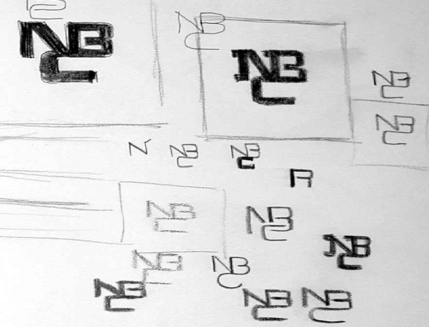
Figure 2
Concepts NBC Snake
92
Design Issues: Volume 19, Number 4 Autumn 2003
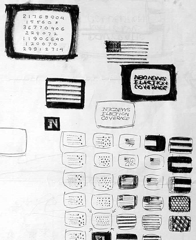

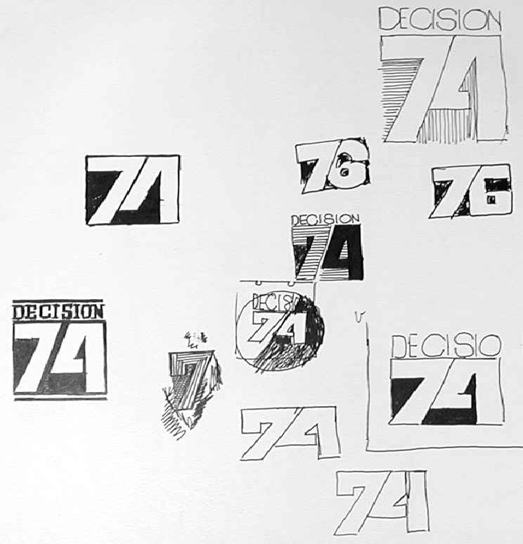
Figure 3
Concept Election Night 1972
Figure 4
Decision 74
Berlin, was dedicated “To Johnny,” designed and colored by hand
by Warhol, written by Charles Lisanby, and included calligraphy by
Julia Warhola, Warhol’s mother.
Among his own book designs, Graham’s Somehow It Works,
a visual portrait of the 1964 Presidential election published by
Doubleday, was lauded as one of the “50 Best Books of 1965” by the
American Institute of Graphic Arts. In an NBC interdepartmental
correspondence letter dated April 19, 1966, Grossman wrote that
the honor “is another outstanding recognition of the extraordinary
talents of John Graham.” Somehow It Works was exhibited worldwide
as part of AIGA’s 1965 ensemble. The book featured photographs by
David Hollander and Paul Seligman.
Figure 4
Decision 74
Design Issues: Volume 19, Number 4 Autumn 2003
93
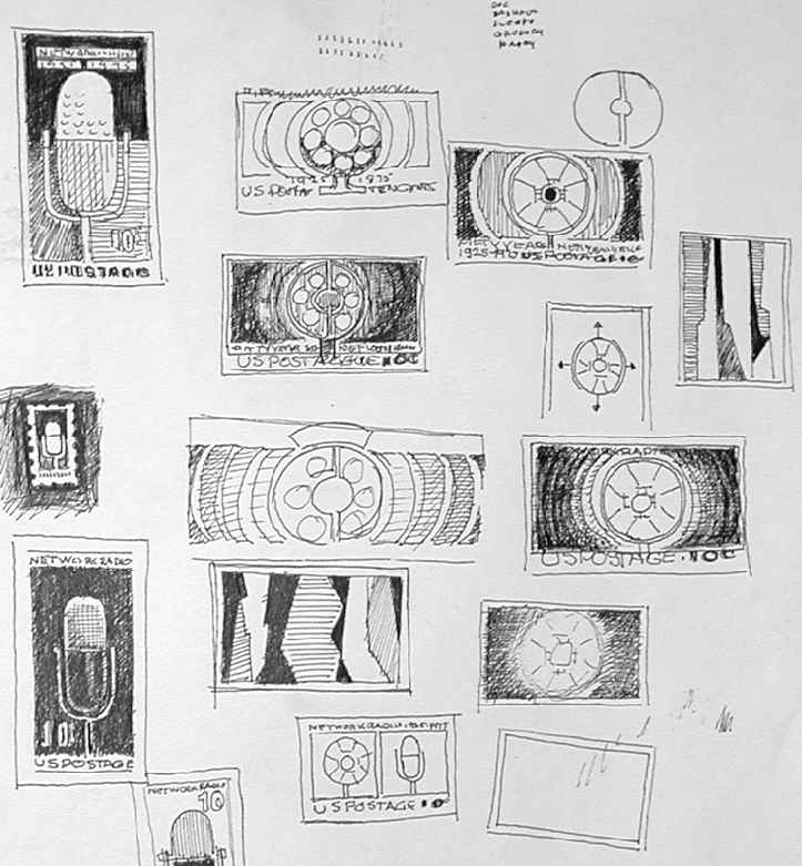

Figure 5
Broadcast M icrophone Illustrations
Despite an impressive body of work, Graham has received
little attention in historical accounts of corporate identity campaigns
and graphic design. When he passed away on June 12, 1994, the
only published obituary his family found was in TV Guide. A reader
wrote, “In the news, they said a man named John Graham had died,
and that he was very important to NBC. I missed the part about
how.” A TV Guide ghostwriter responded: “He didn’t appear on-
screen and wasn’t a star, but he was indeed important to NBC. As an
artist working for the network, Graham in the 1950s created the NBC
peacock logo, one of the most endearing symbols in TV history... .”
Grossman states that, despite his contributions, Graham was
“a vastly under-appreciated art director,” especially from a corporate
perspective. Dorfsman adds that he was “an incisive idea person, a
first-rate designer, and a first-rate art director.” Dorfsman first met
Graham in the early 1950s, and recalls that he “didn’t have a press
department to promote him like I did [at CBS].”
When Grossman came to NBC, he immediately recognized
Graham’s talent. “For the first time, John had someone who really
appreciated his work,” recalls Dorfsman. Grossman had come from
the elegant designs of CBS,” and therefore valued “Graham’s great
sense of what would work, and what images and metaphors could
convey. He had a sense of simplicity, and clarity of communication.
He was a genius in many ways,” recalls Grossman. As an individual,
Dorfsman states that Graham “was quiet ... a modest guy,” a char-
acteristic that was reflected in his work: designs that were far from
flashy, pompous, or overdone.
Above all else, Graham was a family man and commuted
everyday from his home in Pennsylvania to NBC’s headquarters in
New York City. As a result, he went home a little earlier than other
designers. The art design industry, says Dorfsman, required long
94
Design Issues: Volume 19, Number 4 Autumn 2003

hours and “if you left early, you lost stature. At the end of the day,
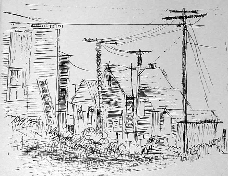
Figure 6 (left)
Cape Cod
people look around and wonder where you are.”
In 1977, after thirty-two years at NBC, Graham was uncer-
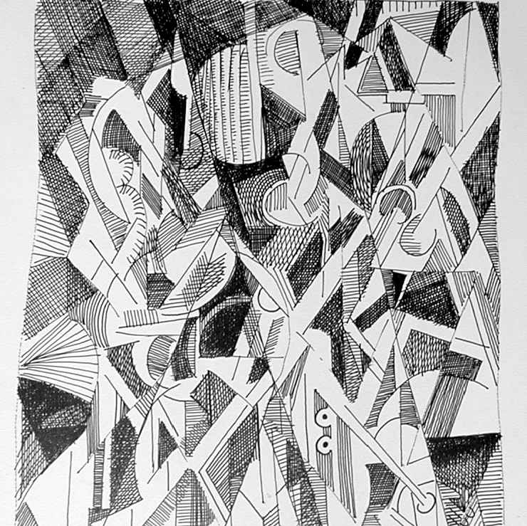
Figure 7 (right)
emoniously discharged. A November 1977 Variety Magazine article,
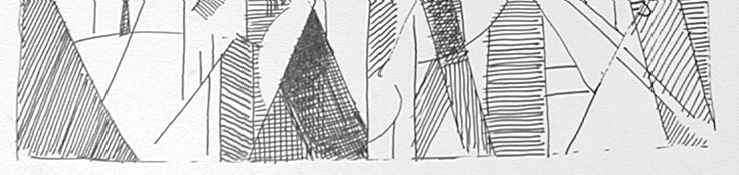
Cubism in Pen and Ink
“NBC Axes Four Execs in Advertising Area,” stated that “NBC’s
busy guillotine fell last week on the advertising and creative services
departments ... and, in the unkindest cut of all, John Graham, who,
as director of design, dreamed up the NBC peacock.”
Around the same time, the peacock and the snake logo gradu-
ally had been phased out and replaced by NBC’s “Abstract N” logo
in 1976, which was created by an outside design firm. With produc-
tion costs totaling an estimated $750,000 to $1 million, shortly after
its unveiling, NBC was sued for copyright violation by Nebraska
Public Television, which had an almost identical logo. The peacock
returned by 1979—a less ornate version with just six feathers instead
of eleven, and a rounder, symmetrical body—with a new slogan,
“NBC, Proud as a Peacock,” but there was little mention of the art
designer who originally created it.
A logo, a symbol, and an effective technique for the intro-
duction of color television, the NBC peacock will always remain
an indelible image in the hearts of the viewing public. In his book
Design, Form, and Chaos, Paul Rand writes, “A well-designed logo,
in the end, is a reflection of the business it symbolizes. It connotes
a thoughtful and purposeful enterprise, and mirrors the quality of
its products and services.” By producing a design that captured the
full potential of color television during the medium’s infancy, John
Graham created a symbol that has lasted for generations. His legacy
has touched more lives than we’ll ever know.
Design Issues: Volume 19, Number 4 Autumn 2003
95
Highlights of John Graham’s Career
Born:
September 25, 1923
Education:
New York School of Industrial Art.
Advertising design training with Howard
Trafton at the Art Students League (three years).
NBC
November 1, 1945–December 31, 1977
Employment:
NBC Art Director of Advertising and Promotion,
1956–1977
NBC Director of Design, 1966–1977.
Honors:
American Institute of Graphic Arts Awards,
1955, 1956, 1958-1960, and 1963–1965.
American TV Commercials Festival Awards,
1965.
Art Directors Club Awards, 1956–1957, 1960–
1961, 1965–1966, and 1968.
Communication Arts Magazine Awards, 1963
Curtis Paper Company Awards, 1953, and 1955.
Direct Mail Advertising Association Awards,
1953
Hollywood Radio and Television Society
Awards, 1974.
Lithographers National Association Inc. Awards,
1955.
New York Employing Printers Association Inc.
Awards, 1955–1957.
Printing Industries of Metropolitan New York
Inc. Awards, 1963.
Radio Daily Award, 1955.
Society of Illustrators Awards, 1959, 1967, 1968,
1969.
Type Directors Club of New York Awards, 1957,
1958, 1959, 1961, 1963, 1964, 1965, and 1967.
Typo Mundus 20 Awards (Date Unknown).
96
Design Issues: Volume 19, Number 4 Autumn 2003